Stout and Gallant has been a client for a long time. Their logo was designed by the talented Jeff Kliemann back in the early days of the Web.
The Stout and Gallant website was very innovative in its day… but technology and best-practices have changed a heck of a lot since it was built. Frankly, the site had become an embarrassment to the company. So we had a frank discussion about what the company website should be:
Modern. Mobile-friendly and SSL encrypted.
Simple and Direct. State what the company does, provide some visuals, a few details and contact information.
There was no need for more than a single page to convey that and no need for a clunky CMS to manage that amount of information. This plus a few other experiences in 2019 would eventually lead to what we now call Elevator Sites. Single page sites that Make a quick but compelling argument with modern design and a low price tag.
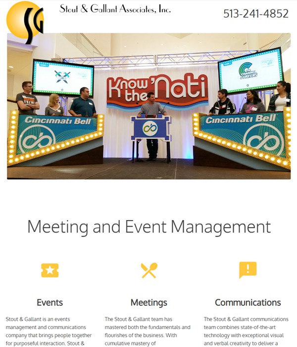
We came up with two designs, one using parallax scrolling and one with a more conventional hero-slider layout. The hero slider was just what the client wanted -- a clean, clear, and visually compelling introduction to their services.