About a year ago in February 2020 (the end of the before times) I gave a talk about web design trends. I think a lot of those trends are still true but there is a very interesting piece of data that’s worth mentioning.
The importance of mobile friendliness can’t be overstated. An incredible amount of U.S. web traffic is conducted on smartphones. While mobile traffic makes up more than 50% of all web traffic in much of the world, interestingly, U.S. mobile traffic didn’t overtake big screen (laptop & desktop) traffic until late in 2019. This is most likely due to the fact that in many parts of the world, big computers are impractical and expensive… especially compared to an android burner that can be picked up for $10 at a corner store and charged with a solar brick if you live in a place with limited infrastructure. (I’m not saying his is the actual case, just that the barrier to entry for a smartphone is super low compared to a traditional computer.)
For instance, in Asia, smartphone traffic passed desktop/laptop browsing back in 2015.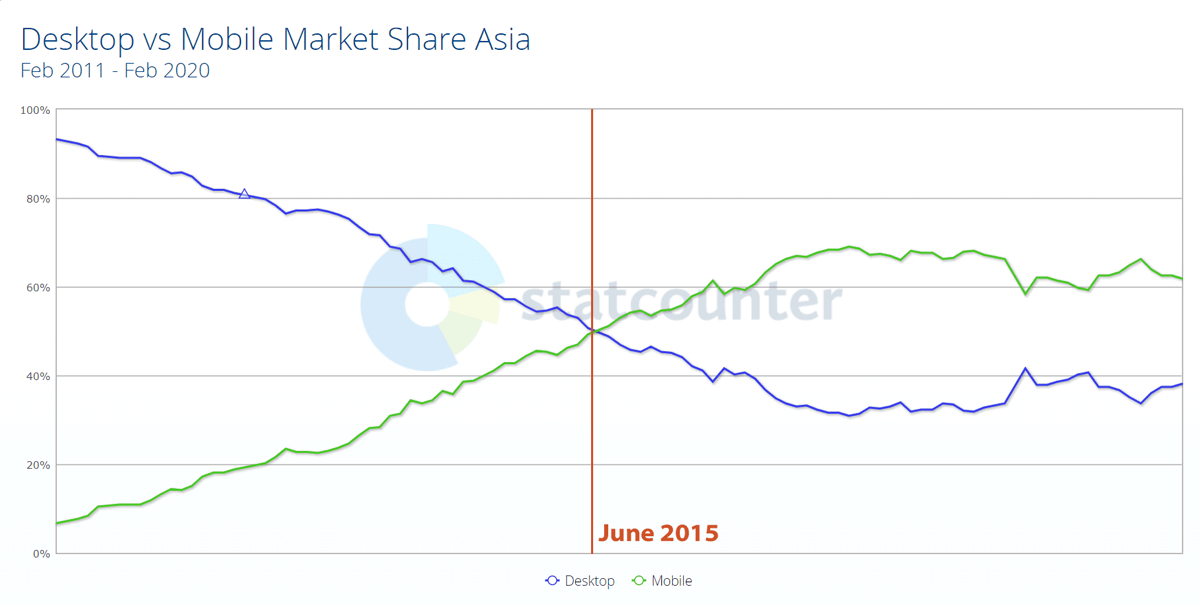
US web traffic finally crossed the threshold where there was more mobile traffic than desktop in November 2019: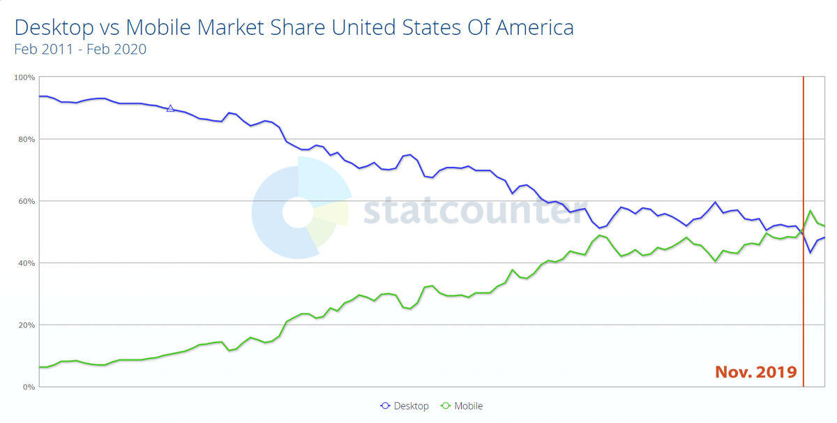
However, as the world locked-down, we see the trend go back to its old ways.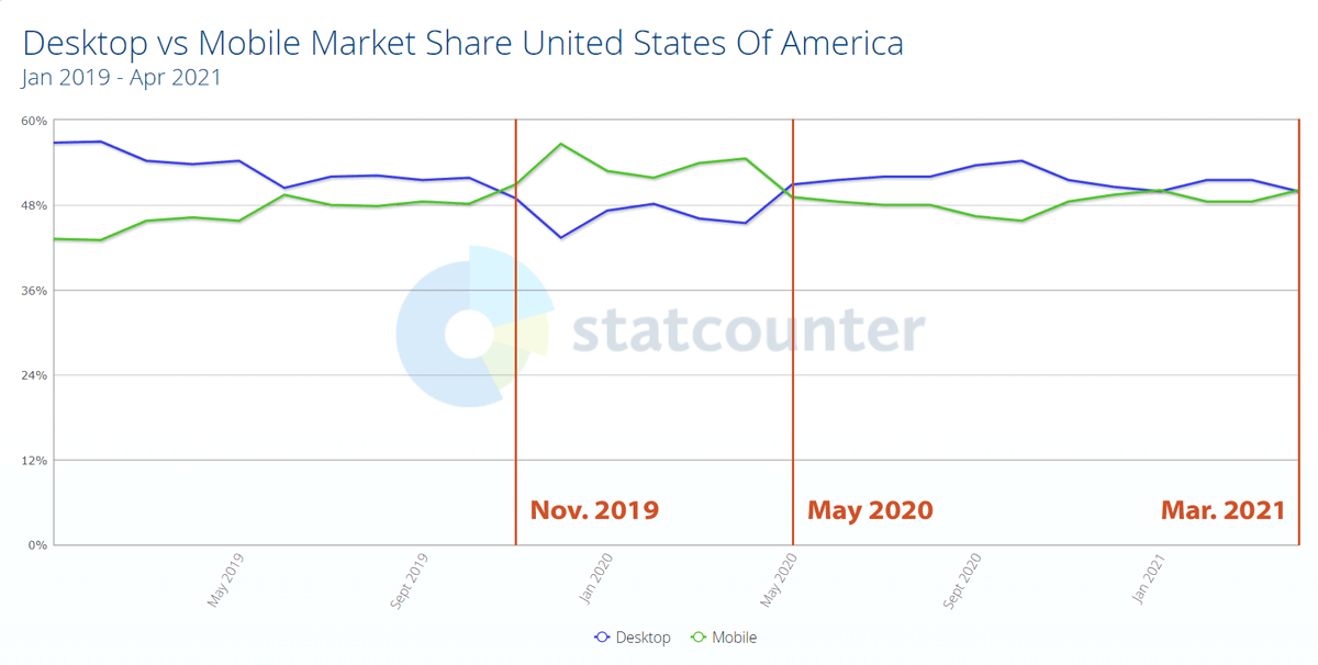
People stayed home. There was literally less “mobile” in all our lives. All the little moments spent waiting in lines, riding subways, killing time before meetings, etc. that had been filled with smartphone time all went away. People needed to get work done so they sat at their computers.
Sure we still played games on the couch. But a lot of quick web browsing done on our phones was done on a computer simply because we were already there, and because big-screen browsing is a superior experience. You can see more info and make better, faster choices. Mobile browsing is always a compromise.
Mobile-first design
I’ve always had a problem with the idea of mobile-first design. It’s been a buzzword in web design for the past decade. The idea (as I understand it) is to design by distilling all content down to the essential stuff, making sure that works on a small screen, then add extraneous stuff back on bigger screens to take up space... and I absolutely hate that.
On mobile, you’re able to do less because you have less. Limiting what you can do on a desktop because you “value consistency so go with the lowest common denominator,” is ridiculous. Don’t add extraneous things to the desktop experience, add useful things. Make something good and powerful that has real value. Then create a mobile subset that approximates it, or that does what needs to be done in the field.
Mobile-prioritized design?
For a while, I advocated this type of mobile-rethinking. Where mobile design would be a reprioritization of things that people would need access to when they are out and about. This means providing top access to the things you need to quickly grab when moving. Things like: today’s store hours, a calendar of today’s schedule, big buttons that link to maps and phone numbers. In other words, designing the mobile interface around a the tasks most frequently performed with a mobile device.
But this proved too confusing to explain. People (aka clients, no offense) want consistency, not usability. And I completely understand that argument. The mobile versions of some desktop apps simply don’t have the features you need. It’s incredibly frustrating. So now the whole world stuffs a desktop menu into a hamburger button: ☰ And that’s not such a bad thing. It absolutely makes things consistent and easier to manage. And most websites are info hubs or small online shops. It makes sense.
The Fallout of Mobile-first
But you know what doesn’t make sense? Full-screen sites on a 30” monitor that hide all their navigation inside a ☰ menu. It adds a click and users can’t glance ahead and make decisions about what to click before they click. It turns web browsing into an inefficient and plodding process.
I know it looks “so clean!!!” But if that’s what you want, then maybe you should just post a photo and skip the website.